BEEF Rebrand
An experimental rebrand between two designers
Concept
Revenge, rawness, unveiling the mask beneath the surface.
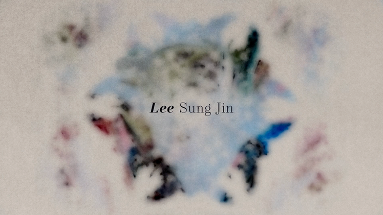
The show Beef uses a series of title cards instead of a traditional title sequence, each featuring a unique painting by David Choe in collaboration with Sarofsky. These abrupt yet artistic title cards reflect the characters’ flaws, blending high-art pretension with irony through font choice and editing. This stylistic choice establishes the show’s chaotic tone — highlighting everyday hypocrisy and elevating it into something wild and unpredictable, aligning with creator Lee Sung Jin’s vision.
However, the show did not have a title sequence, and we are now creating one.
Brand Packaging Sizzle
This is a collaborative project with designer Himani Todi. Our initial concept was to merge our strengths — vector design and stop motion — to create a title sequence that aligns with the design aesthetic of BEEF.
The design direction underwent two major changes. Initially, our concept was to create a stop-motion and frame-by-frame animation on paper, using a gradual zoom-in technique to symbolically reveal the protagonist’s inner turmoil. The first revision shifted towards cinematography, focusing on unsettling and grotesque close-up shots to align with the eerie atmosphere of BEEF’s style boards. Finally, we embraced a more experimental approach. Utilizing the fluid movement of paint and the way light interacts with its surface, we crafted a distinctive color palette. By seamlessly integrating carefully edited stock footage, we created a cohesive yet unconventional final piece — one that preserves the boundary-pushing spirit of our initial revision.
The paint photography was a collaborative effort between both designers. I took charge of integrating and post-processing all the assets, cropping and mirroring the footage to achieve our desired compositions. Using color range selection and masking, I extracted the necessary elements while adjusting speed and applying color correction. The refined assets were then passed to Himani Todi, whose editing work, especially from the second to the fifth scene, greatly enhanced the visual impact. I finalized the last scene and made final adjustments. Additionally, we created a complete BEEF packaging mockup.
Keywords
Drame Tension Revenge
Uncomfortable Love Hate
Obsession Raw Strong
Early Design
.jpg)
.jpg)
.jpg)
.jpg)
.jpg)
.jpg)
We decided to focus on the emotional essence rather than the literal icons we initially planned. By using close-up macro shots of food and paint, we capture the show's distinct style and its striking, unexpected visuals as the subject gradually reveals itself.
Process & Behind the Scene


